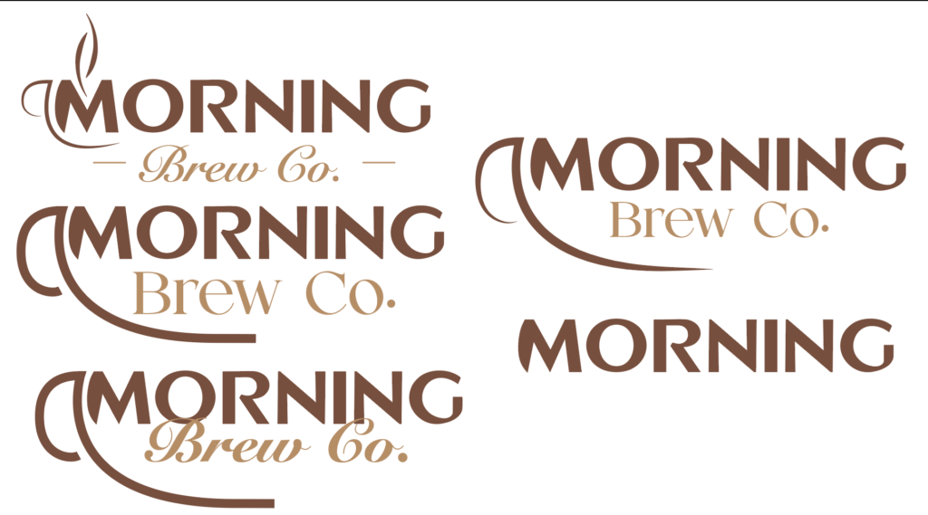
I have a couple of rough drafts of my logo so far. Here are a couple. I did find the colors that I want, a dark brown and a rich lighter brown, both resembling coffee itself. I am leaning towards the top left logo. I incorporated a coffee cup, the M curves into the cup, going with the line of the cup. I also added a couple of steam lines to make the coffee cup more prominent.
The only thing that I am really focusing on now is the Brew Co. font. I want something that fits. At the moment, nothing feels 100%. These are still rough drafts, so I will make sure to update you once it is complete.